

Using Color Palettes
Setting up a theme's pre-defined color palette.
Color palettes are a core part of the theme defined in the Theme Designer.
Using the theme color palette via the color picker helps users select predefined colors that are true-to-brand. (It doesn't, however, prevent users from choosing colors outside of the color palette.)
The Color Picker
Users can access the theme color palette from any color selection field. For example, the Background expander in the Block 1 accordion has a Color setting. Once you select the text field for this setting, the color picker opens. You can see your theme's color palettes below the color picker.
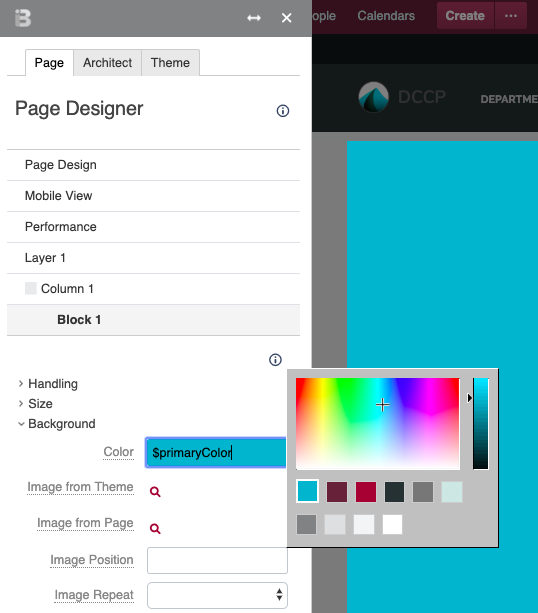
Color Names
When defining your palette, Theme Press assigns a name to each color. This name appears in the text field for any setting using a palette color. Theme Press uses this naming convention to automatically populate your changes throughout the product.
| Palette | Color | Property |
|---|---|---|
| Core | Primary | $primaryColor |
| Core | Secondary | $secondaryColor |
| Core | Accent | $tertiaryColor |
| Tints and Shades | Dark | $darkColor |
| Tints and Shades | Medium | $mediumColor |
| Tints and Shades | Light | $lightColor |
| Grays | Dark Gray | $darkGrayColor |
| Grays | Medium Gray | $mediumGrayColor |
| Grays | Light Gray | $lightGrayColor |
| Grays | White | $whiteColor |


