Page tree

Versions Compared

Key

  • This line was added.
  • This line was removed.
  • Formatting was changed.

Content Layer
namePage Info
id278129461
classwatermark-layer
Content Column
namePage Body
width100.00001%
id278129463
Content Block
background-colortransparent
namePrompt
id494677873
classtight manual-prompt-flex

Adjusting display of the control icon used for Spinning Blocks.

Content Block
nameOutcome
rich-link-hoverstrue
id1042866408
classtight manual-outcome-flex

Inserting a spinning block on a page automatically also creates a control icon (curved arrow) with default theme settings applied. Learn how to adjust the image used for this icon, as well as placement, size, and color in the steps below.

Content Block
nameSteps
rich-link-hoverstrue
id494842117
classsteps-block numbered manual-steps-flex

Open the Theme Designer

Navigate to the Macros Section

Click to open the Spinning Block (Control) expander

HTML Wrap
classdocs-screenshot

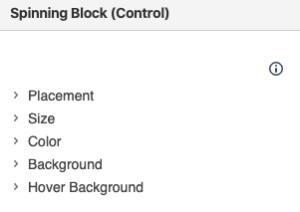
Adjust Placement, Size, and Color as needed

Use the fields to adjust placement in respect to the block itself. Additionally, you can adjust the color, hover color, and size of the icon.

Note: you can click on any underlined help text in the designer for more information.

Add a background image

Selecting a new background image and hover background image allows you to alter the look and feel of the control icon.

Content Block
nameNote
rich-link-hoverstrue
id495965127
classmanual-note-flex
collapsiblecollapse
Note

If using:

  1. Replace me with something to note about this how-to entry that falls outside the scope of all other sections; and
  2. Add the tight-bottom class to the Steps block above to narrow the gap between the two blocks.
Content Block
nameTip
rich-link-hoverstrue
id894522670
classmanual-tip-flex
Tip

Looking to swap out the control icon for a new image?

Set the color and hover color of the image as transparent, and use a different image in the background setting, allows for an alternate image for the control icon

If using:

  • Replace me with something to note about this how-to entry that falls outside the scope of all other sections; and
  • Add the tight-bottom class to the next visible/non-collapsed block above this one to narrow the gap between the two blocks

    .

    Content Block
    nameWarning
    rich-link-hoverstrue
    id894530759
    classmanual-warning-flex
    collapsiblecollapse
    Warning

    If using:

    1. Replace me with something to note about this how-to entry that falls outside the scope of all other sections; and
    2. Add the tight-bottom class to the next visible/non-collapsed block above this one to narrow the gap between the two blocks.
    Content Block
    nameInfo
    rich-link-hoverstrue
    id894537203
    classmanual-info-flex
    collapsiblecollapse
    Info

    If using:

    1. Replace me with something to note about this how-to entry that falls outside the scope of all other sections; and
    2. Add the tight-bottom class to the next visible/non-collapsed block above this one to narrow the gap between the two blocks.
    Content Layer
    background-color$lightGrayColor
    nameRelated
    id888168050
    Content Column
    nameRelated
    width100%
    id888168051
    Content Block
    rich-links-hide-descriptiontrue
    rich-link-hoverstrue
    rich-links-columns4
    rich-links-verticaltrue
    rich-links-image-height100px
    rich-links-hide-site-icontrue
    rich-links-details-padding10px
    nameRelated
    rich-links-enabletrue
    border-width0
    rich-links-details-alignmentleft
    rich-links-margin20px 30px 0 0
    id496234544
    classrelated-block clean manual-related-flex