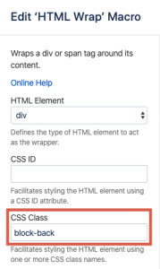
Page tree

Versions Compared

Key

  • This line was added.
  • This line was removed.
  • Formatting was changed.

Content Layer
namePage Info
id278129461
classwatermark-layer
Content Column
namePage Body
width100.00001%
id278129463
Content Block
background-colortransparent
namePrompt
id494677873
classtight manual-prompt-flex

Designing a content block with two sides of information.

Content Block
nameOutcome
rich-link-hoverstrue
id1042866408
classtight manual-outcome-flex

An interactive, dual-sided block can be useful to help defer complexity for users, allowing access to deeper information only when needed.

Designating a block to 'spin' with two sides of content is a fairly straightforward process of adding two instances of the HTML Wrap Macro (one for each side) within one block. The content desired for each side of the block is added inside each of the macros. 

Example

html
wrap
content-
block
background-color$lightColor
padding40px
margin0 220px
nameSpinning
rich-link-hoversfalse
id1543200673
classtight
height50px
200px
HTML Wrap
20pxwidth
classblock-front

A Spinning Block

200px
HTML Wrap
background-color$primaryColor
padding20px
width
classblock-back

Looking for a visually interesting and effective way to present dense information? Consider a spinning block!

Looking for a visually interesting and effective way to present dense information? Consider a spinning block!

 within that block

Add a class to the first macro

In the CSS Class field, enter the following class:

block-front

Add a class to the second macro

In the CSS Class field, enter the following class:

block-back

Content Block
nameOutcomeSteps
rich-link-hoverstrue
id1543200673494842117
classtight steps-block numbered manual-outcomesteps-flex

An interactive, dual-sided block can be useful to help defer complexity for users, allowing access to deeper information only when needed.

Designating

Add a block to

'spin' with two sides of content is a fairly straightforward process of adding

a page

Add two instances of the HTML Wrap Macro

(one for each side). The content desired for each side of the block is added inside each of the macros. 

Example

HTML Wrap
background-color$lightColor
padding20px
width200px
classblock-front

A Spinning Block

HTML Wrap
background-color$primaryColor
padding20px
width200px
classblock-back
HTML Wrap
classdocs-screenshot

Image Added

Save the edits

Click the spinner icon to give your block a test run.

Content Block
nameStepsVariations
rich-link-hoverstruefalse
id494842117583851964
classsteps-block numbered manual-steps-flex

VARIATIONS

Want to rotate horizontally instead?

Add the following two classes to the second HTML Wrap macro:

block-back flip-up

Use h4 for section headings

If you don't want numbers in the section headings, simply remove the "numbered" class from this block.

Note/Tip/Warning/Info blocks below are collapsed by default. If you want to use any of these, try to keep to just one per page. You may use two if necessary, but in general, try to limit these.

Content Block
nameNote
rich-link-hoverstrue
id495965127
classmanual-note-flex
collapsiblecollapse
Note

If using:

  1. Replace me with something to note about this how-to entry that falls outside the scope of all other sections; and
  2. Add the tight-bottom class to the Steps block above to narrow the gap between the two blocks.
Content Block
nameTip
rich-link-hoverstrue
id894522670
classmanual-tip-flexcollapsiblecollapse
Tip

Settings at both the page-level (block options) as well as the macro level can be adjusted to suit your design needs. In the example above, padding and margin, as well as background color, have been added to the page-level block settings:

Image AddedImage Added

If using:

  • Replace me with something to note about this how-to entry that falls outside the scope of all other sections; and
  • Add the tight-bottom class to the next visible/non-collapsed block above this one to narrow the gap between the two blocks.

    Content Block
    nameWarning
    rich-link-hoverstrue
    id894530759
    classmanual-warning-flex
    collapsiblecollapse
    Warning

    If using:

    1. Replace me with something to note about this how-to entry that falls outside the scope of all other sections; and
    2. Add the tight-bottom class to the next visible/non-collapsed block above this one to narrow the gap between the two blocks.
    Content Block
    nameInfo
    rich-link-hoverstrue
    id894537203
    classmanual-info-flex
    collapsiblecollapse
    Info

    If using:

    1. Replace me with something to note about this how-to entry that falls outside the scope of all other sections; and
    2. Add the tight-bottom class to the next visible/non-collapsed block above this one to narrow the gap between the two blocks.
    Content Layer
    background-color$lightGrayColor
    nameRelated
    id888168050
    Content Column
    nameRelated
    width100%
    id888168051
    Content Block
    rich-links-hide-descriptiontrue
    rich-link-hoverstrue
    rich-links-columns4
    rich-links-verticaltrue
    rich-links-image-height100px
    rich-links-hide-site-icontrue
    rich-links-details-padding10px
    nameRelated
    rich-links-enabletrue
    border-width0
    rich-links-details-alignmentleft
    rich-links-margin20px 30px 0 0
    id496234544
    classrelated-block clean manual-related-flex