- Open the Theme Press Designer by pressing the "." (period, full stop) key.
- Click on the Space Tab. (note: in previous versions, it was called the Architect Tab).
- Expand the Space Theme accordion.
- Click the Use Space Theme button
Changing the defualt site themeAs a designer, you change the theme to which all Theme Press spaces default. Use the following procedures to set the site default. - Open the Theme Press Designer and choose the Theme tab.
- Under the Themes section, expand the Site Theme accordion.
- Click the magnifying glass to the right of the Site the Space Theme setting setting.
- Select a theme from the the Available Themes section section.
The The Change Site Default Space Theme window window opens. - Confirm Click the OK button to confirm the change by checking the box.Click the OK button and wait for the theme to update.
If you don't want numbers in the section headings, simply remove the "numbered" class from this block. Note/Tip/Warning/Info blocks below are collapsed by default. If you want to use any of these, try to keep to just one per page. You may use two if necessary, but in general, try to limit these.
| HTML Wrap |
|---|
| 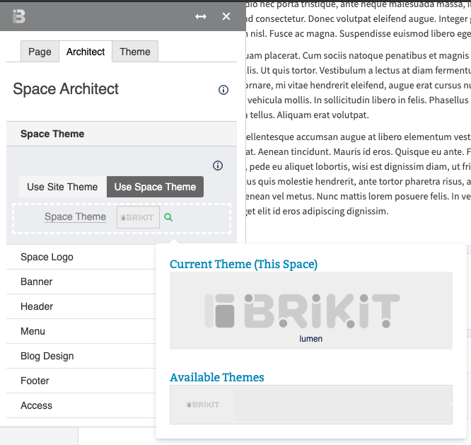 Image Added Image Added
|
| 


