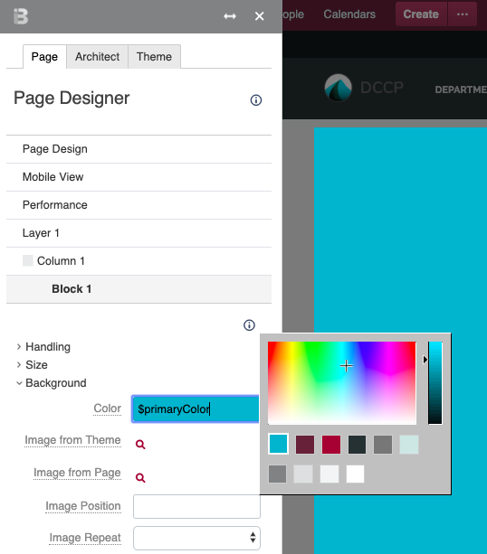
The Color PickerUsers can access the theme color palette from any color selection field. For example, the Background expander in the Block 1 accordion has a Color setting. Once you select the text field for this setting, the color picker opens. You can see your theme's color palettes below the color picker. | HTML Wrap |
|---|
| 
|
Color NamesWhen defining your palette, Theme Press assigns a name to each color. This name appears in the text field for any setting using a palette color. Theme Press uses this naming convention to automatically populate your changes throughout the product. | Palette | Color | Property |
|---|
| Core | Primary | $primaryColor | | Core | Secondary | $secondaryColor | | Core | Accent | $tertiaryColor | | | | |
|---|
| Tints and Shades | Dark | $darkColor | | Tints and Shades | Medium | $mediumColor | | Tints and Shades | Light | $lightColor | | | | |
|---|
| Grays | Dark Gray | $darkGrayColor | | Grays | Medium Gray | $mediumGrayColor | | Grays | Light Gray | $lightGrayColor | | Grays | White | $whiteColor |
| 


