Open the NavigatorTo make is clear what changes are made during styling, open the Navigator by pressing the "z" key. Making changes in the Theme Press Designer will be reflected directly in the Navigator. Open the Theme Press Designer and set it to the right-side of your screenUse the period "." key to toggle open the designer, then click the ↔ button in the top-right corner of the Designer to shift it to the right side of the screen. Under "HTML Structure" expand the "Navigator" section| HTML Wrap |
|---|
| 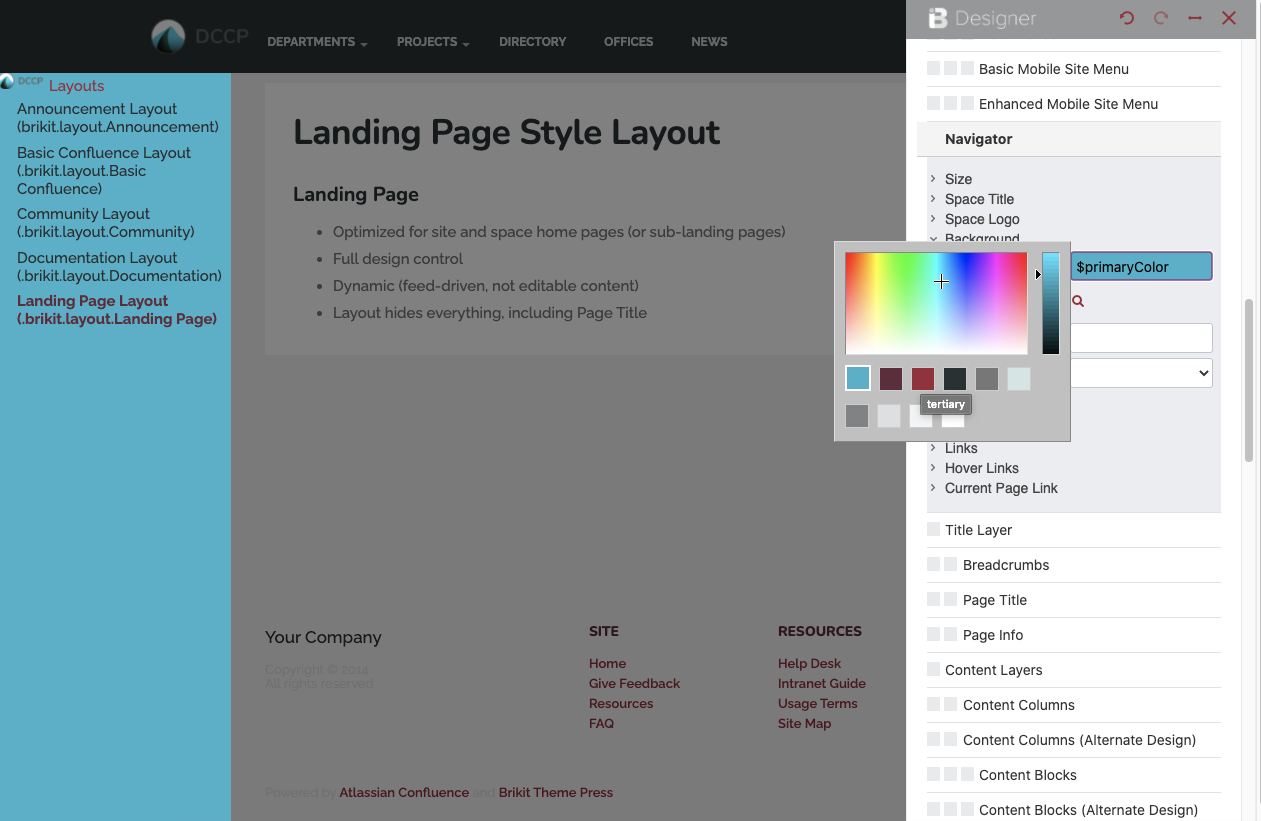 Image Modified Image Modified
|
Update the elements as you see fitUnder the various expanders you can change the space title, background color, link size and color, and many other options. Some changes may require you to refresh the page, while others will update automatically.
| 


