Page tree

Versions Compared

Key

  • This line was added.
  • This line was removed.
  • Formatting was changed.

Content Layer
namePage Info
id278129461
classwatermark-layer
Content Column
namePage Body
width100.00001%
id278129463
Content Block
background-colortransparent
namePrompt
id494677873
classtight manual-prompt-flex

Enable the Navigator sidebar for use on a layout.

Content Block
nameOutcome
rich-link-hoverstrue
id1042866408
classtight manual-outcome-flex

Edit a layout's page elements section to show the Navigator on all pages that use that layout.

Content Block
nameSteps
rich-link-hoverstrue
id494842117
classsteps-block numbered manual-steps-flex

Create a layout

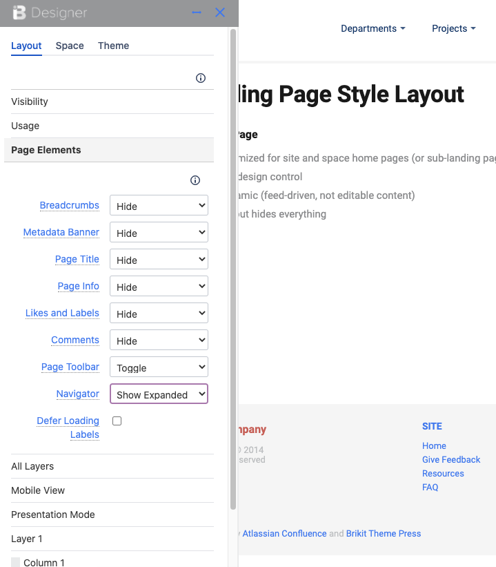
A Theme Press layout (or Page Design) is the structure to which the Navigator is attached. You'll first need to create a layout (or edit an existing layout).

Open the Theme Designer and click the Layout tab

Expand the Page Elements section

HTML Wrap
classdocs-screenshot

Next to the Navigator field, change the selection

Select Learn more about Toggling, Pinning, or Hovering the Theme Press Navigator. In sum: select "Show Expanded" to have the Navigator open by default on any page that uses this layout. By contrast, select "Show collapsed" to keep the Navigator out of view by default, but able to be toggled open using the "z" key.  To ensure that there is no Navigator present for this layout, just select "Hide".

Allow the Layout page to refresh to express your changes

That's it! Any page or space set to this Page Design (layout) will have the Navigator enabled. It's a great alternative to the Confluence Sidebar, which can be safely hidden away with the "shift" and "z" keys.


Content Block
nameNote
rich-link-hoverstrue
id495965127
classmanual-note-flex
collapsiblecollapse
Note

If using:

  1. Replace me with something to note about this how-to entry that falls outside the scope of all other sections; and
  2. Add the tight-bottom class to the Steps block above to narrow the gap between the two blocks.
Content Block
nameTip
rich-link-hoverstrue
id894522670
classmanual-tip-flex
collapsiblecollapse
Tip

If using:

  1. Replace me with something to note about this how-to entry that falls outside the scope of all other sections; and
  2. Add the tight-bottom class to the next visible/non-collapsed block above this one to narrow the gap between the two blocks.
Content Block
nameWarning
rich-link-hoverstrue
id894530759
classmanual-warning-flex
collapsiblecollapse
Warning

If using:

  1. Replace me with something to note about this how-to entry that falls outside the scope of all other sections; and
  2. Add the tight-bottom class to the next visible/non-collapsed block above this one to narrow the gap between the two blocks.
Content Block
nameInfo
rich-link-hoverstrue
id894537203
classmanual-info-flex
collapsiblecollapse
Info

If using:

  1. Replace me with something to note about this how-to entry that falls outside the scope of all other sections; and
  2. Add the tight-bottom class to the next visible/non-collapsed block above this one to narrow the gap between the two blocks.
Content Layer
background-color$lightGrayColor
nameRelated
id888168050
Content Column
nameRelated
width100%
id888168051
Content Block
rich-links-hide-descriptiontrue
rich-link-hoverstrue
rich-links-columns4
rich-links-verticaltrue
rich-links-image-height100px
rich-links-hide-site-icontrue
rich-links-details-padding10px
nameRelated
rich-links-enabletrue
border-width0
rich-links-details-alignmentleft
rich-links-margin20px 30px 0 0
id496234544
classrelated-block clean manual-related-flex