One of our heroes of graphic design, Debbie Millman, explains this way of being, often referred to as being 'design-led,' as "listening to your audience, understanding what their needs are, and then using that information to create the most powerful expression of whatever it is you’re creating.” Jennifer Kilian of McKinsey further states, "Design Thinking ... matters for business, because it's the single biggest competitive advantage that you can have. If you solve for your customer's needs first, you’ll always win."  Image Added Image Added
Here at Brikit, Making Life Beautiful is a beloved core value. Designing to enrich experience and enhance understanding, we describe design as our "primary weapon against complexity and chaos." Critical to our overall company culture and our purpose, design has been at the heart of our company since Day One. Although technology and software focused, we’re proud to be design-led here at Brikit, framing our approach to all of our work through four design disciplines: visual, information, technology, and solution design. We think a great deal about solving problems visually within that first discipline, and while we don't get the opportunity often to work purely on brand identity, a critical piece of our work is interpreting brands into fully-realized, familiar, beautiful 'homes' for those living those brands — the teams putting heads together, day after day, to get the job done. Naturally, we're pretty keen to get our own brand identity on solid ground. As the lead designer behind the past two iterations of our company’s identity, I knew the face of our brand needed help; as a growing but uniquely close-knit company, richly steeped in design, our values had remained constant, but our culture and "family dynamic" had evolved and deepened. Additionally, our very work had become enriched and further developed, radiating out across all four design disciplines. Millman defines branding as “deliberate differentiation,” with the ultimate outcome bringing that brand to life, showing how it “lives in the world,” and the resulting visual realization of the brand confidently conveying the brand’s point of view. It was readily apparent that what made Brikit BRIKIT had evolved, in some beautiful directions, and our brand, our culture, was no longer being adequately captured in our visual identity. One rainy early spring weekend, at the very end of Puget Sound, on a rocky beach in Washington Sate, our visual design team came together to steep in everything we knew about the culture of Brikit, and how we live in the world, doing our best work. The end goal? Crafting a reimagined and newly powerful expression of our Brikit brand. | HTML Wrap |
|---|
| 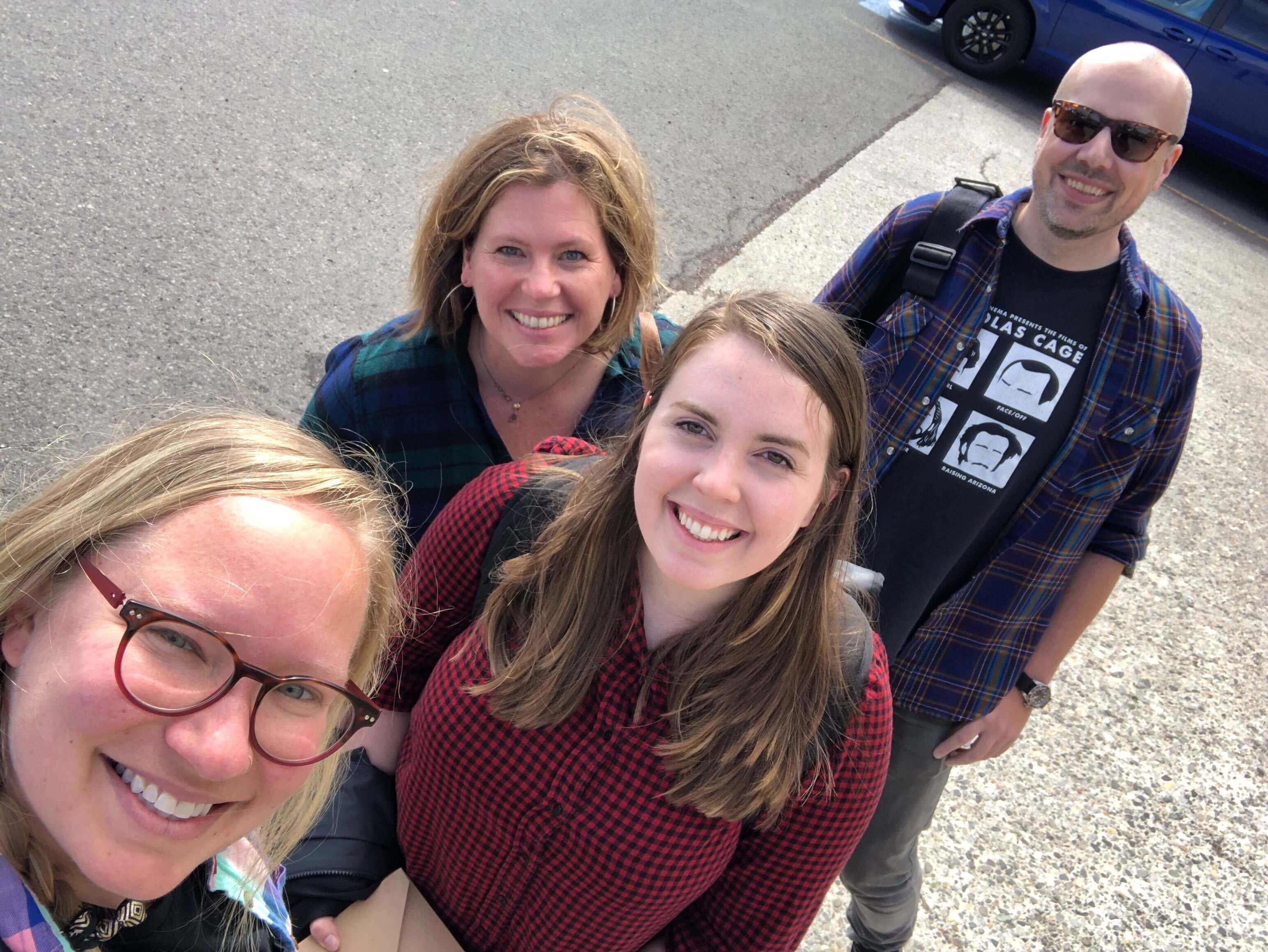 Image Added Image Added
|
We skipped the trust falls; as every creative knows, there’s enough vulnerability in our day-to-day design lives, offering up what we have crafted for critique and constant revision. We span life stages, genders, and backgrounds, but our small team, like our larger Brikit team, works together like a highly-functioning family. We know and value each other’s strengths and count on them to put wind in our sails and joy in our steps, allowing us a team, as always, to move faster and better together. This rich weekend of brainstorming and creative expression was no exception. Lead Designer Bridget Prendergast tells it this way: "It was a really valuable and fun time to bond as a team and bond with our brand. We had uninterrupted time to really let our brains steep in the whole creative process and what came out of it was something that we all felt was a part of us as a collective team. Because of that space we created, I feel a connection and ownership with this brand in a way I’ve never felt with others."
The new Brikit identity, hatched across deep work, solid snacks, and a refreshing beverage or two, coalesced into a new face that feels fresh, confident, innovative, and friendly, projecting a cheerful playfulness and approachability, in shape and fresh color palette and yet maintaining the reliability and professionalism for which our company is known.
 Image Added Image Added
It is an identity that honors our past while also believing in our future: the three-color logomark nods back to the graphic foundational stepping stones which have been part of our identity since our company began. With our new brand, these stones, these building blocks, have been reimagined in a new orientation and fresh palette. (This logomark also looks forward to our revolutionary next-generation thinking of grids and "briks," and presentation modules: stay tuned on that one!) My favorite unlock of our creative team dive? The brightly colored 'jots,' which light up against the letterforms, conveying movement, forward motion, transit, and ‘wayfinding’ — a graphic representation of connecting teams with what they are looking for, and a strong nod to our warm embrace of information design, which we believe goes hand in hand with visual design. Setting our company name in a neutral gray is a bold, intentional move, reinforcing a solid, reliable underlying foundation for teams at work: we create a beautiful home that just works — and then? We get out of your way.
 Image Added Image Added
Ultimately, more than a year later, with our new brand living out in the world, and further developed into a fully-functioning design system, we are overjoyed at how our brand has come to life.
Again, in Bridget's words: "I feel really proud of the work we did. It was absolutely a team effort and I think we all played a role in helping it come together to a finished product that felt very natural. It felt like a clear, fresh and fun representation that finally matched the direction our team and company was heading. More than a year later it still feels authentic and versatile — and very much US."
|