Designers can create palettes In any theme, a palette of pre-defined colors is determined for users to access (in addition to the color picker) so that color use can easy user access, allowing color use to stay true-to-brand. Building color palettes requires permission to access the Theme DesignerAdditionally, these palettes determine how color selection cascades out into an overall theme design. There are three different palettes you can work with.palette areas: | The Core Palette | The Tints and Shades Palette | The Grays Palette |
|---|
These are three distinct colors that can be used to identify a space for a company, a department, a product, or a specific activity. 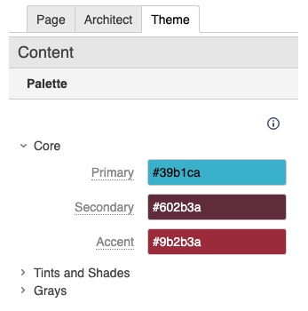
| This palette defines light, medium and dark tints/shades that coordinate with the Core Palette. 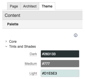
| This palette of white, light gray, medium gray, and dark gray is used to provide emphasis and variety. 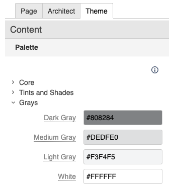
|
Creating these color palettes doesn't prevent users from choosing other colors. - The palette options are displayed directly below the color picker in any color selection context, within the Theme Press Designer.
- Additionally, the palette options are the first options in the Confluence editor color picker.
- Creating these color palettes does not prevent users from choosing other colors.
| 


