The core action button style is set in the Macro area of the Theme Designer. | HTML Wrap |
|---|
| 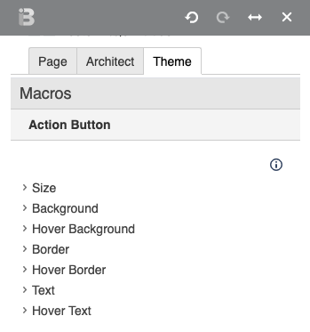 Image Added Image Added
|
Insert the Action Button macro on any page. Fine tune display with the macro parameters. | HTML Wrap |
|---|
| In the example below, a button has been added with the Action Button macro, linking to the Brikit documentation homepage. A class added to the macro alters the look and feel of the button from the theme default styling. Additionally, the position and margin fields have been used to align the button in the lower right corner of this callout block. | Action Button |
|---|
| margin | 0 90px 72px 0 |
|---|
| link | documentation:Documentation Home |
|---|
| text | Take me home |
|---|
| align | bottom right |
|---|
| class | small-button |
|---|
|
|
If you don't want numbers in the section headings, simply remove the "numbered" class from this block. Note/Tip/Warning/Info blocks below are collapsed by default. If you want to use any of these, try to keep to just one per page. You may use two if necessary, but in general, try to limit these. | 


