For any page, navigate to the Mobile View.| HTML Wrap |
|---|
| tag | span |
|---|
| class | product-navigation |
|---|
| Theme Press Designer → Page Tab → Mobile View |
Click on + Mobile Version.| HTML Wrap |
|---|
| 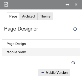 Image Added Image Added
|
| HTML Wrap |
|---|
| - The newly created page will end in .mobile.phone
- You can toggle between desktop and mobile versions in the Page Designer
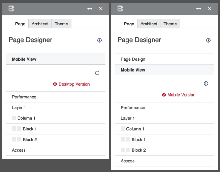 Image Added Image Added
|
To:- Open the Mobile View tool
Theme Press Control Panel > Page Tab > Mobile View accordion > Create Mobile View - Click on "+ Mobile Version"
The page created will end in .mobile.phone Use the  Image Removed and Image Removed and  Image Removed buttons to toggle between pages. Image Removed buttons to toggle between pages. Mobile pages are located in a separate .brikit.mobile tree of your page hierarchy. To make a page mobile friendly (without creating a new page), you might want to just hide a column or blockHere's how:Theme Press Control Panel > Page tab > expand column or block > Handling > check box for "Hide on Mobile" | 


