Toggling, Pinning, or Hovering the Theme Press Navigator
Configure the Navigator to open and display in a way the best suits your desired user experience.
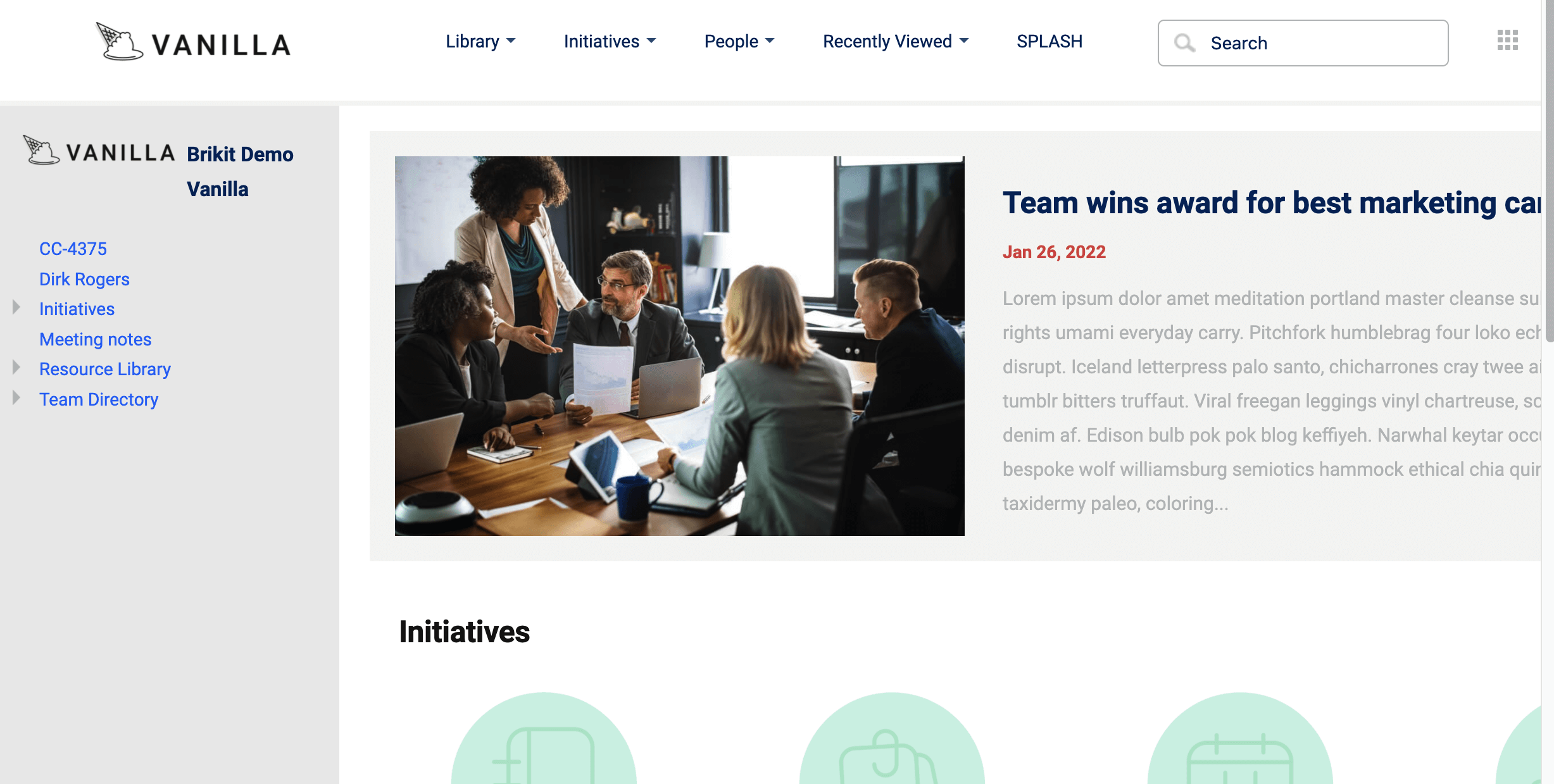
The Theme Press Navigator is a customizable, stylish alternative to the Confluence Sidebar. The Navigator is defined as a page element of your Theme Press Page Design. It can be set to be opened by default, opened on hover, or hidden, and toggle-able via hotkey. So wherever a Page Design is used, either space-wide or on a particular page, that is where the Navigator will be used and according to the setting you define.
Open the Theme Press Designer
Use the "." (period) hotkey to toggle open the Designer.
Locate the Page Design, click the eyeball icon to view it
If you are using the space default page design, click the "Space" tab and open "Page Design". If the page is overriding the space default, then click the "Page" tab and click Page Design. Locate the selected page design. Clicking the eyeball icon will open the architect page in the Theme Press Default space.
On the Page Design architect page, open the Theme Press Designer
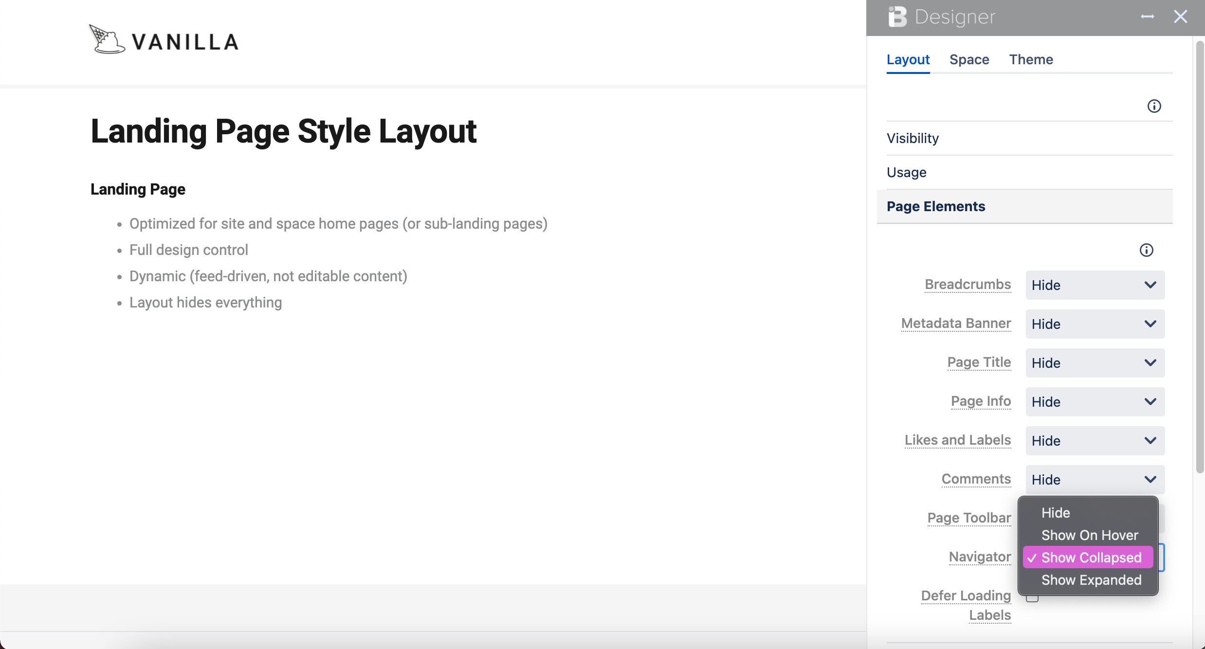
Click the "Layout" tab, then expand the "Page Elements" section
Select your Navigator setting
Choose between the following settings:
| Option | Description | Toggle with "z" key? |
|---|---|---|
| Hide | The Navigator is completely hidden and not accessible via hotkey. | |
| Show on Hover | The Navigator hugs the left side of the screen as a sliver and expands on hover. Click the circle-arrow icon to pin open or shut. | |
| Show Collapsed | The Navigator is hidden but able to be opened and closed with the "z" hotkey. | |
| Show Expanded | The Navigator is open by default, but able to be closed and hidden with the "z" hotkey. |
On refresh, your settings are saved for this page design
Wherever this page design is used, the Navigator setting selection will be available for that page.
