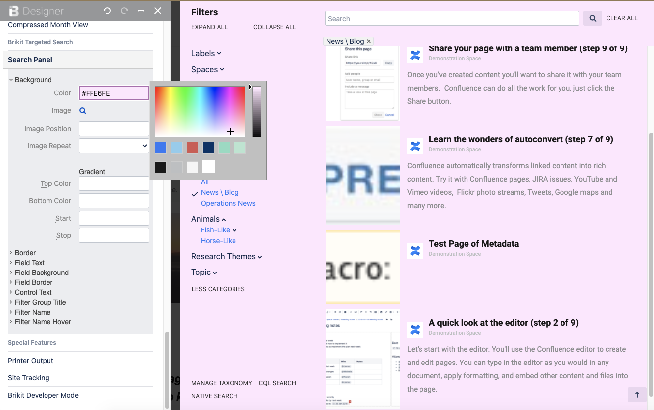
Page tree

Versions Compared

Key

  • This line was added.
  • This line was removed.
  • Formatting was changed.

Content Layer
namePage Info
id278129461
classwatermark-layer
Content Column
namePage Body
width100.00001%
id278129463
Content Block
background-colortransparent
namePrompt
id494677873
classtight manual-prompt-flex

Use the Theme Designer to adjust the look and feel of the Targeted Search Search Panel.

Content Block
nameOutcome
rich-link-hoverstrue
id1042866408
classtight manual-outcome-flex

With Theme Press and Targeted Search both installed, users can style the Search Panel according to their theme and brand specifications.

Content Block
nameSteps
rich-link-hoverstrue
id494842117
classsteps-block numbered manual-steps-flex

Open the Theme Designer

Click the "." hotkey to toggle open the Theme Press Designer. Ensure that the Designer is on the left side of the screen. If not, click the "Move Designer" button ↔  to move the Designer to the left side.

Navigate to the Theme Tab

You must be a system administrator or in a group with permission to access the designer.

Scroll down to "Brikit Targeted Search" heading

Click to open the "Search Panel" expander

Pause to open the Search Panel

It is helpful to have the Search Panel open as you make visual changes so that you can see what's happening. To do so, click on the search input field on your page; typically this is via Targeted Search Field Macro input or a Targeted Search Link Macro button.

HTML Wrap
classdocs-screenshot

Edit the fields as you see fit

You can change the styling of the search field, panel background, filter groups and filters, and much more.


Content Block
nameNote
rich-link-hoverstrue
id495965127
classmanual-note-flex
collapsiblecollapse
Note

If using:

  1. Replace me with something to note about this how-to entry that falls outside the scope of all other sections; and
  2. Add the tight-bottom class to the Steps block above to narrow the gap between the two blocks.
Content Block
nameTip
rich-link-hoverstrue
id894522670
classmanual-tip-flex
collapsiblecollapse
Tip

If using:

  1. Replace me with something to note about this how-to entry that falls outside the scope of all other sections; and
  2. Add the tight-bottom class to the next visible/non-collapsed block above this one to narrow the gap between the two blocks.
Content Block
nameWarning
rich-link-hoverstrue
id894530759
classmanual-warning-flex
collapsiblecollapse
Warning

If using:

  1. Replace me with something to note about this how-to entry that falls outside the scope of all other sections; and
  2. Add the tight-bottom class to the next visible/non-collapsed block above this one to narrow the gap between the two blocks.
Content Block
nameInfo
rich-link-hoverstrue
id894537203
classmanual-info-flex
collapsiblecollapse
Info

If using:

  1. Replace me with something to note about this how-to entry that falls outside the scope of all other sections; and
  2. Add the tight-bottom class to the next visible/non-collapsed block above this one to narrow the gap between the two blocks.
Content Layer
background-color$lightGrayColor
nameRelated
id888168050
Content Column
nameRelated
width100%
id888168051
Content Block
rich-links-hide-descriptiontrue
rich-link-hoverstrue
rich-links-columns4
rich-links-verticaltrue
rich-links-image-height100px
rich-links-hide-site-icontrue
rich-links-details-padding10px
nameRelated
rich-links-enabletrue
border-width0
rich-links-details-alignmentleft
rich-links-margin20px 30px 0 0
id496234544
classrelated-block clean manual-related-flex